Role
UX Researcher, UX/UI Designer
Duration
4 Weeks
Tools
Figma, Microsoft Clarify, Google Analytics
Optimising the Life Interiors Collection Page to Enhance Browsing & Conversion
The Life Interiors collection page redesign aimed to enhance the overall user experience by improving visual clarity, streamlining navigation, and optimising filtering options, with the goal of increasing user engagement, reducing bounce rates, and boosting conversion potential.
PROBLEM
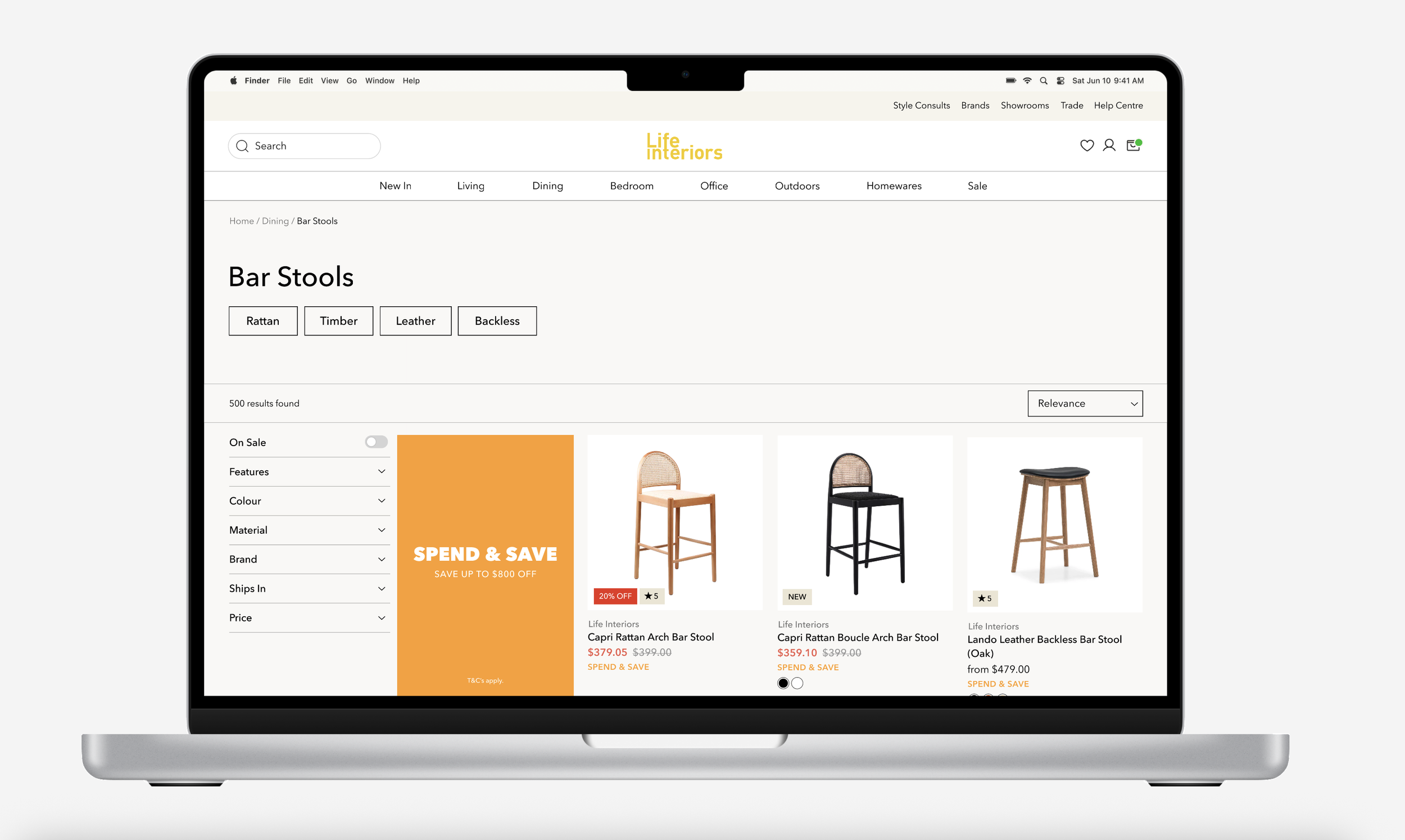
The current page lacks clarity and easy navigation, making browsing difficult
The objective was to improve the overall user experience while aligning the design with business outcomes such as increased engagement, reduced bounce rates, and higher conversion potential.
RESEARCH
I kicked things off with a heuristic evaluation to uncover key pain points
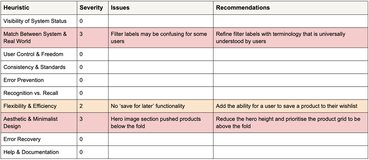
Key insights from the heuristic evaluation included refining filter labels to use universally understood terminology, introducing wishlist functionality, and reducing the hero section height to ensure the product grid appears above the fold.
RESEARCH
Next, I analysed heatmaps to see how users interacted and where they struggled
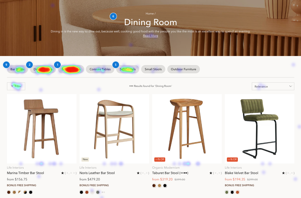
To better understand user behavior, I implemented heatmap tracking to analyse clicks, scrolls, and hovers. The data showed that category pills drove initial engagement, filters were underutilised, the hero section provided limited value, and most users did not scroll beyond the first row of content.
RESEARCH
To spot opportunities, I looked at competitors’ sites to see what worked and what didn’t
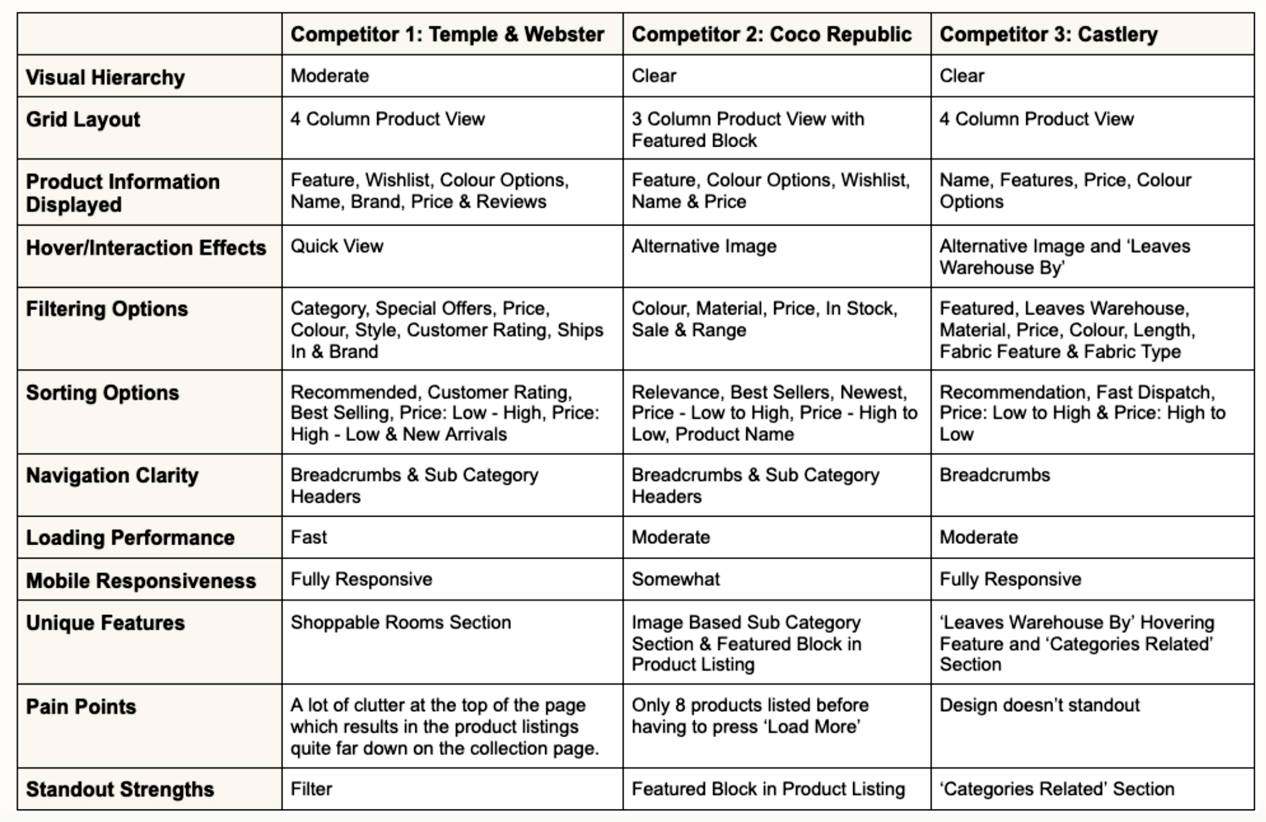
This analysis revealed opportunities to refine our current filtering system, introduce a ‘featured’ product block to highlight key promotions, and implement a ‘load more’ button to improve product browsing continuity.
DEFINE
Using these insights, I redefined the problem to better reflect user’s needs and behaviors
The current collection page layout and filtering experience fail to support efficient product discovery due to underutilised filters, a low-utility hero section, and poor content prioritisation below the fold, resulting in missed engagement opportunities and reduced browsing depth.
DESIGN
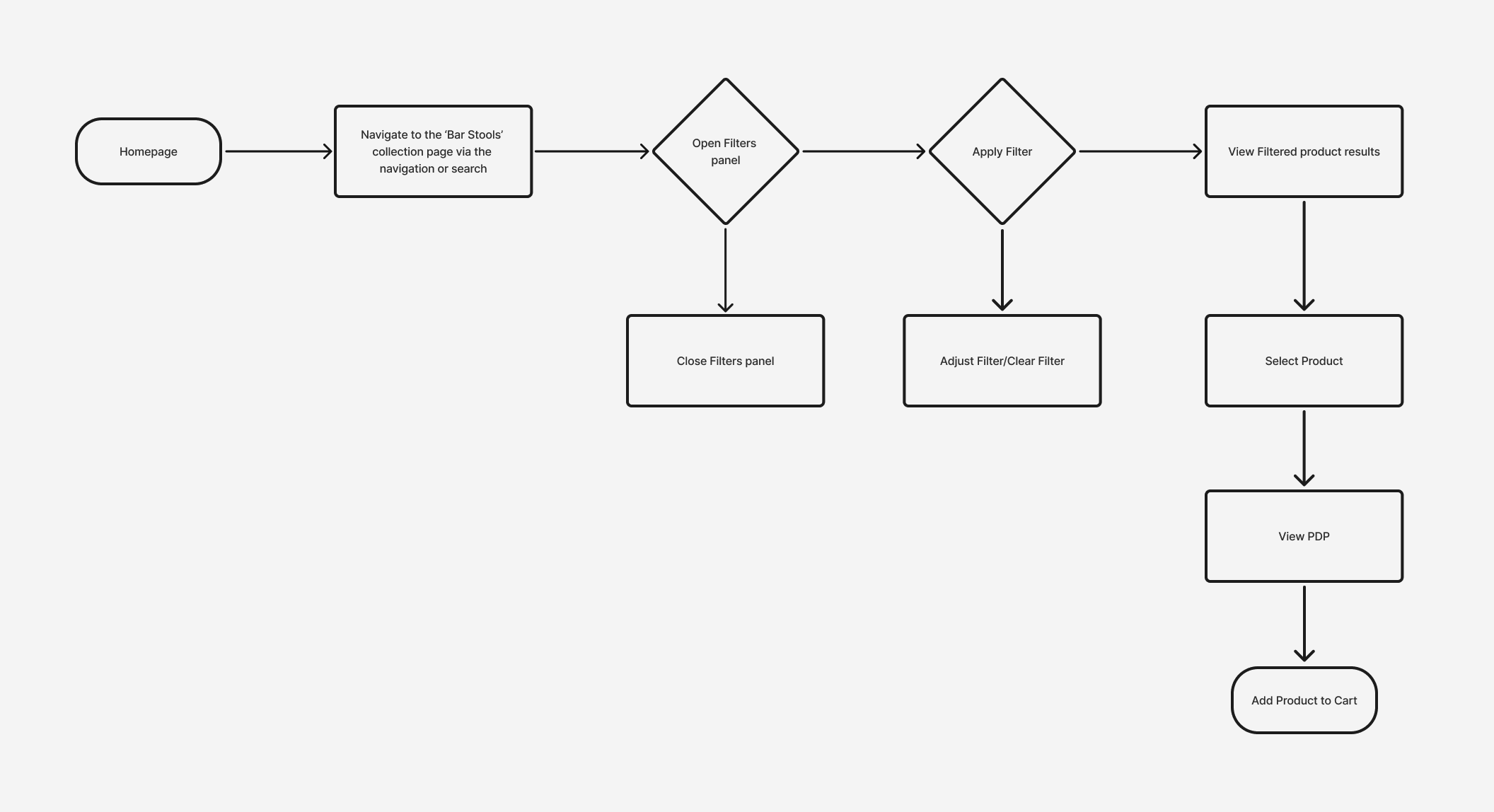
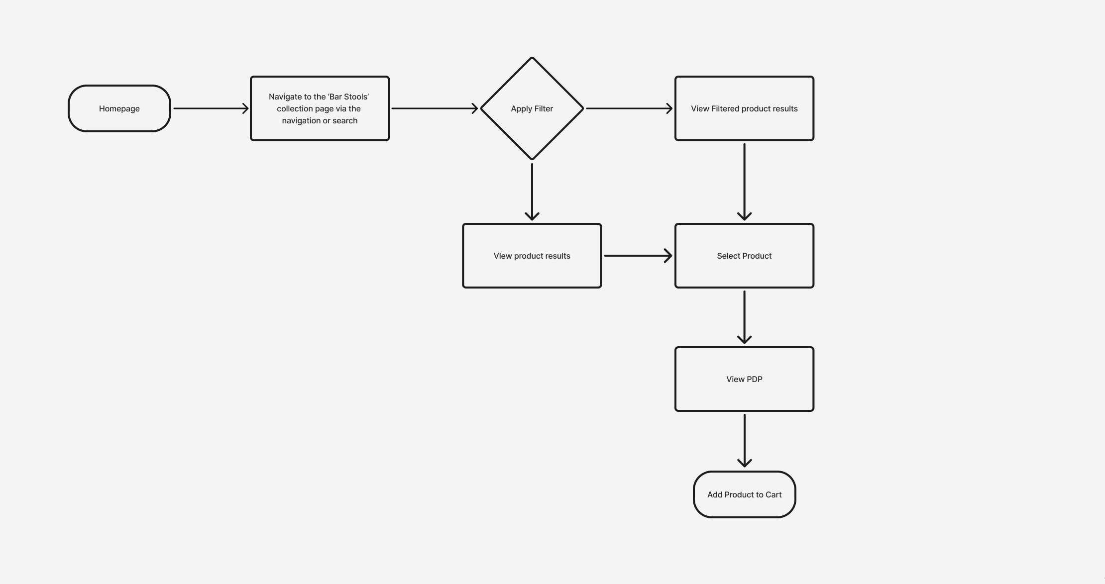
I mapped out the current vs ideal user flow for a purchasing customer
Current User Flow
Ideal User Flow
PROTOTYPE
With the key pain points identified, I translated my findings into low-fidelity wireframes to shape the solution
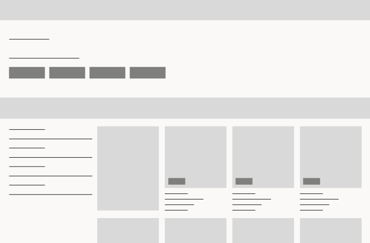
I began the design process by creating low-fidelity wireframes to map out the core structure and layout of the collection page. These wireframes were essential for establishing the basic flow and functionality of page, allowing me to quickly explore different design directions without focusing on aesthetics.
PROTOTYPE
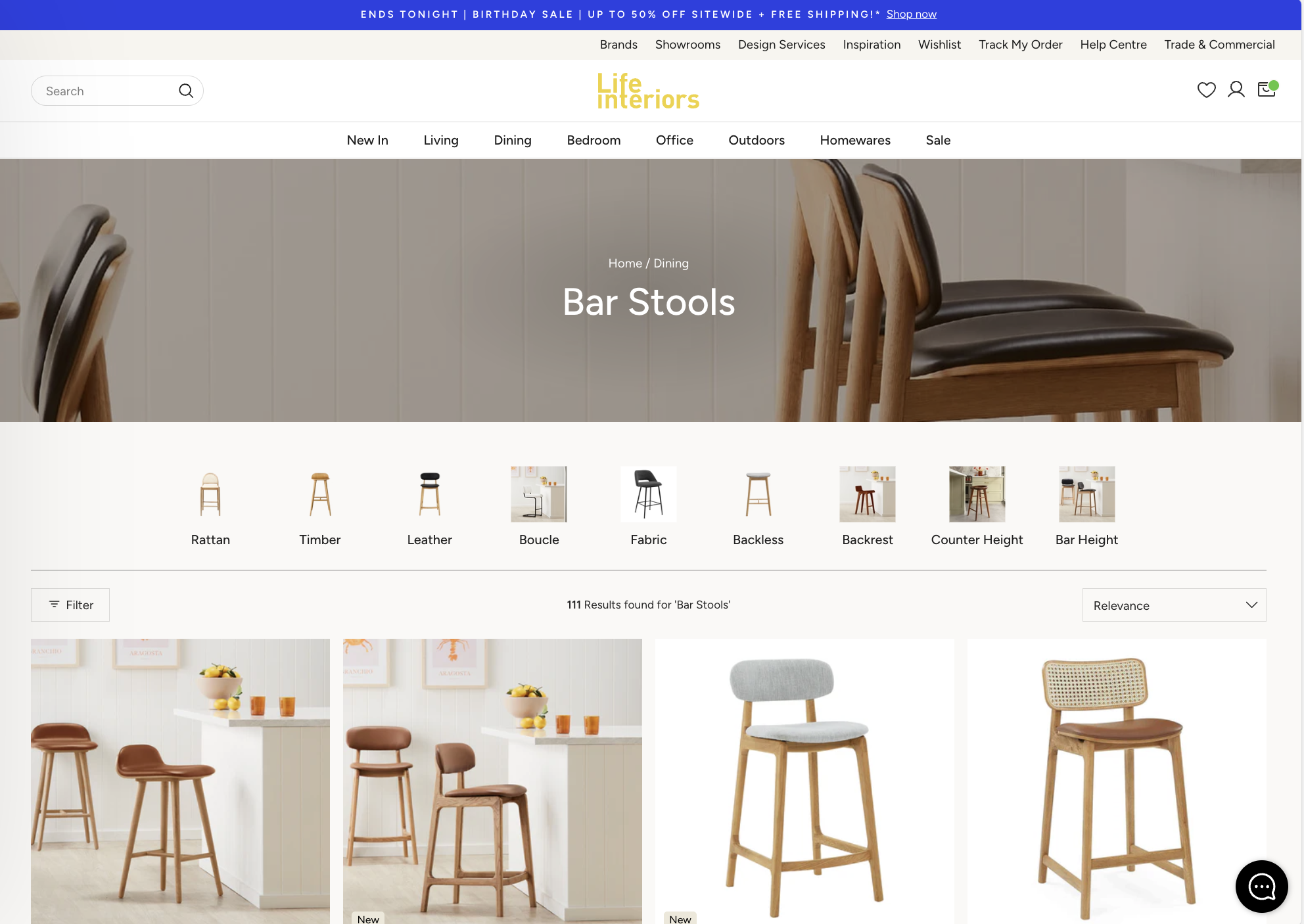
I then developed a high-fidelity prototype to refine the visual design, interactions, and overall usability
REFLECTION
Well, was it successful? Yep.
The redesign improved page structure and visual hierarchy, resulting in clearer content flow and deeper engagement. Post-launch data showed the 75th-percentile scroll depth moving further down the page, alongside a 30% relative increase in conversion rate (0.29% → 0.38%). While bounce rate rose slightly (64.06% → 65.4%), the increase coincided with higher conversion, suggesting clearer messaging and improved self-selection rather than reduced engagement.
With additional time, I would have validated these changes through moderated user testing and continued iterating on the design to further refine usability and performance.